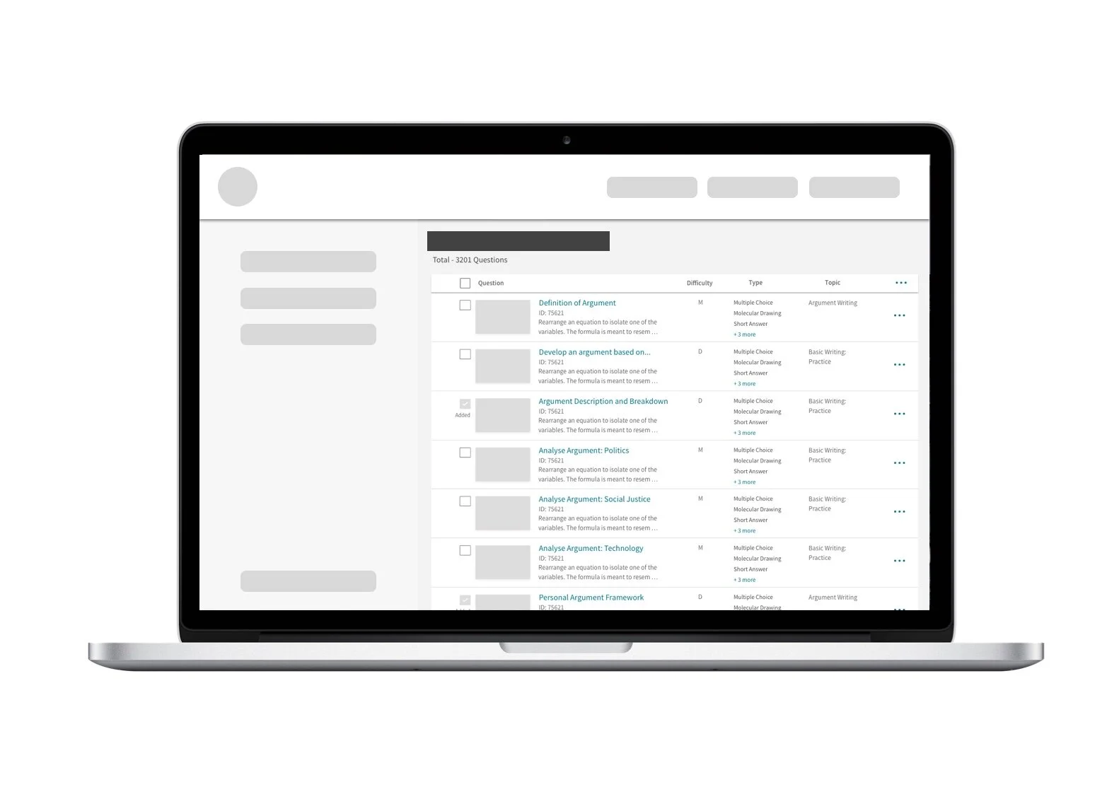
Course Administration
Reducing cognitive load and streamlining interaction flows for online educators when creating and assigning online homework and tests.
Problem Statement
Feedback from users and the Customer Service team showed that current users felt lost when they first logged into the product. The amount of data was overwhelming. The products lacked on-boarding, most of the interactions felt cumbersome and it was unclear how to create a new assignment or edit the existing one. Many educators complained that it was hard to check that an assignment complied with the learning goals for their class.
Users
The target user for this project is an online course instructor in higher education institutions. Their goals within the product are assigning appropriate homework, practice problems, tests and quizzes.
Lead UX Designer
my role on the projectMy responsibilities
Plan and execute large explorative research to understand the current course administration interface and current practices among online educators
Propose an improved design (based on the research phase above)
Test and verify the new design’s performance
Coordinate an updated design with the larger design team to verify the overall design and brand identity
Collaborate with learning-science experts to introduce best learning practices in the updated interface
Collaborate with product and engineering teams to ensure design feasibility
Proactively communicate the progress of the project to internal and external stakeholders
Deliver final designs to the engineering team
Constraints
Hard deadline. Each stage of the project had to adhere to a predefined timeline.
The new design had to work well with the existing design system and branding guidelines.
Technical limitations. Some of the interface elements were inherited from parent products.
Research
I kicked off the project with an extensive research effort. Since the initial goal of the project was rather open-ended, the team and I explored a wide range of possible solutions that could work within project timeline and scope.
To achieve this goal we performed:
Competitive Analysis
Research on assignment-editing best practices
Instructor survey
Heuristic evaluation of the current interface.
We also collaborated with the Customer Service team as they could provide a different view of the issues and problems the users were facing.
1
Survey
51
Participants
10
Questions
Design Iterations
Initial Findings
In the research phase, we discovered that the interface was too complicated for external users. It lacked clarity and focus. It also did not provide any on-boarding for new users. Many of the features were not added strategically, which led to confusion on the part of the users.
Once we completed the initial data gathering phase, I proceeded to the prototyping stage Initially, I wanted to explore two interface approaches, so I created two InVision prototypes and tested them with potential users.
Sample Usability Testing Report
I selected the winning design based on:
Interview and usability testing data
Input from the engineering team
Schedule feasibility (given the tight schedule constraints)
I then produced the final prototype and improved it using the RITE method. This was a highly collaborative process that involved coordination with product, engineering, and other design teams.
The project was completed in 2019. Surveyed users reported they were happier with the new version and were particularly impressed with its ease of use and overall look and feel.
What I have learned from this project
This project had a significant research phase and a firm deadline. At the same time, each step of the progress needed coordination with multiple internal and external stakeholders. It was an excellent opportunity to improve my collaboration and planning skills. The team and I kept each step of the project transparent - this helped us limit the possibility of moving in an undesirable direction. I also got to practice designing and executing research plans under time pressure.


