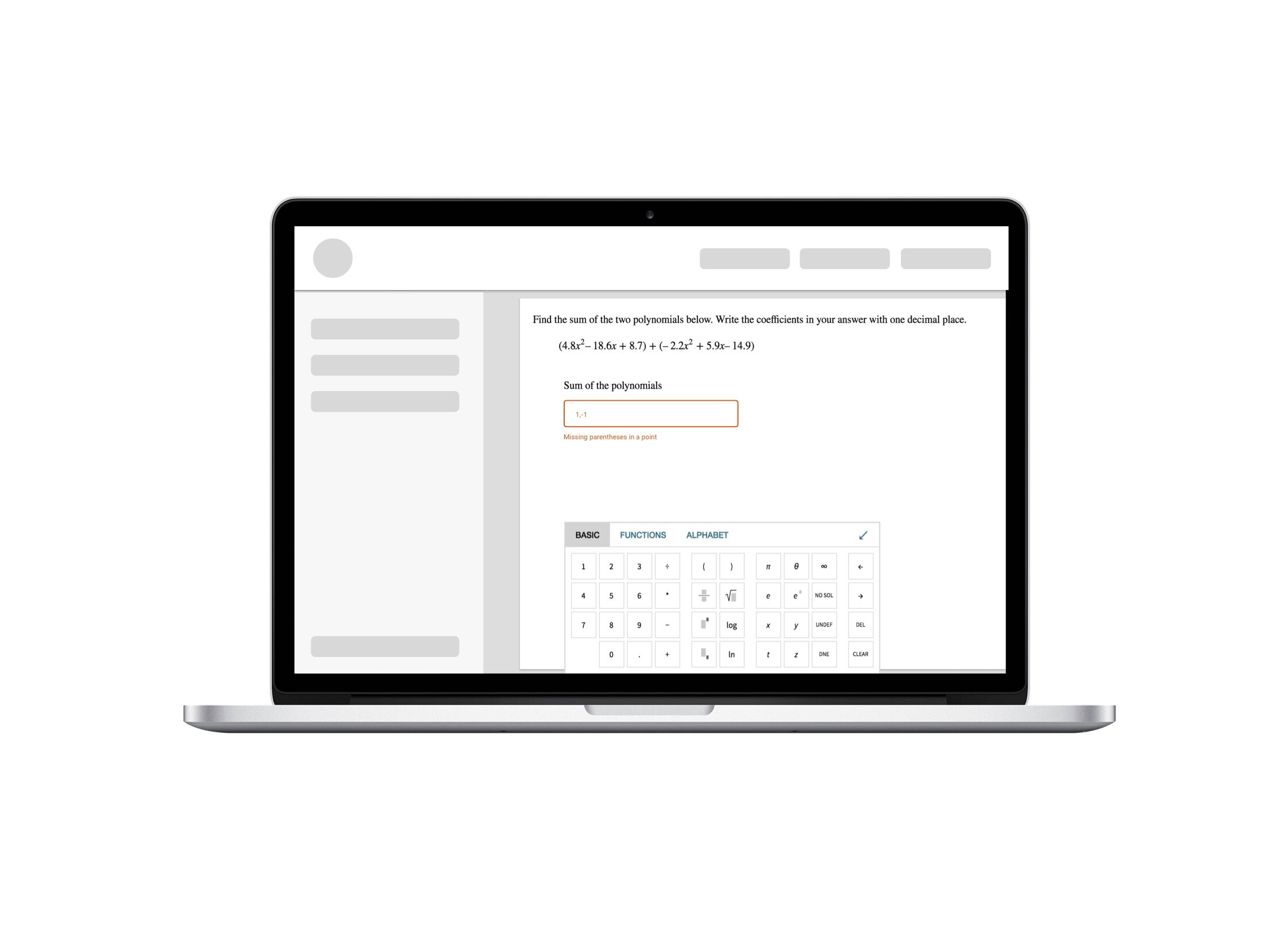
Science Keyboard
Improving the usability and accessibility of the on-screen keyboard interface for math students and educators participating in online classes.
Problem Statement
Students and educators need to submit homework online, and they use an on-screen keyboard for math notation. The existing keyboard was cumbersome and students complained it required a lot of time and resulted in many errors.
Users
The primary user is a student (high school or higher) that is currently enrolled in a math class and needs to use the scientific keyboard to submit their homework online. Based on previous research, we knew that students have different levels of math notation knowledge, and our interface needs to work for both novices and advanced users.
Senior UX Designer
my role on the projectMy responsibilities
Plan and execute validation research
Outline a UX approach to implementing product roadmap
Design and iterate on a high fidelity math keyboard interface
Collaborate with Product and Engineering teams
Constraints
The first release had tight schedules, and therefore had to have a limited feature set. Additional functionality had to be released in a seamless way as each feature became available.
Technical limitations did not allow users to drag and drop the keyboard anywhere on a screen. We had to allow only one location for the keyboard.
The client organization had a legal requirement to achieve a certain level of accessibility in all their interfaces. I needed to pay close attention to screen reader strategy in the final design.
Research & Design
I started by researching the current interface through expert interviews and moderated usability testing to gather insight into the current issues students and educators face. I used this data (along with the list of known issues from the Customer Service team) to craft my initial design proposal.
Strategic Design
The initial design included
basic keyboard layout,
positioning on the screen,
basic feature organization,
new updated icon design,
a new strategy for cursor movement within the interface,
on-screen keyboard interactions with the physical keyboard on the users’ device.
However, in order to release new functionality in the future, we needed a way to add new math notation to the keyboard in a seamless and intuitive way. I achieved this by introducing a contextual section on the default keyboard tab. This section adapted to the type of question the user is working on. This way the keyboard contained all the symbols users needed to enter an answer without navigating away from the main keyboard screen.
Each contextual function on the default tab had a permanent location in other tabs of the keyboard, which reduced the confusion once the user learned the location of a certain symbol.
Additionally, I designed and documented the accessibility strategy for the keyboard. The accessibility scope covered both color and contrast issues and screen reader vocalization strategy. I partnered with accessibility experts within the organization to outline and document screen reader triggers and prompts as they relate to the cursor movement.
Usability Testing
21
Usability Tests
3
Test rounds
4
Iterations
Once the engineering finished the initial prototype, I regularly tested each new feature to verify the performance of the new design. I held 30-minute moderated remote usability tests with both students and educators. Each testing round included 6-8 participants.
Assumptions to verify (Sample)
Users do not like to switch between keyboard and mouse.
Positioning the keyboard at the bottom of the screen will be convenient for the users.
The new math keyboard supports keyboard entry.
New keyboard shortcuts are intuitive to the users.
The basic tab does not require any trig functions. If the most common trig functions appear on the basic tab, it will confuse the users.
The new scientific keyboard was released in 2019 and was a huge success among current users. It is also believed to be a differentiator that will drive new business in the future.
"It looks basic, but yet it has everything."
- Student Participant
What have I learned from this project?
Though this project might seem simple at first glance, many important aspects of this design problem are not obvious without careful consideration of user experience. I selected this project to showcase my work because it clearly illustrates the amount of thought and care needed to create a good design.
Here are a few things that this project made me aware of:
When an interface is used in universities and schools, accessible design is a must. Working through an accessibility strategy was an invaluable experience that made all of my following work more inclusive.
Scientific notation is hard for many students and we need to be aware of the difficulties that different types of users may have. New students vs advanced, sighted users vs screen readers, etc.
Context awareness can help to come up with an adaptive approach to interface organization.


